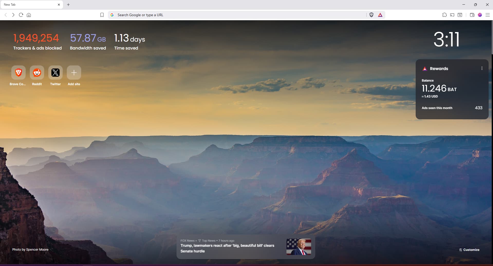
There was no need to add this bar just so we can slide between websites, the “dots” which showed below Brave Stats before were much better. So its my request to the developers working on UI to please remove this ugly thick bar from the New tab page and make the new tab page how it was before… and anyone who agrees with this, please bring this to dev’s attention if you can
This wasn’t “added” – looks like a bug of some kind and is likely do to the fact that you’re using the old NTP design. I’ve asked some team members to take a look.
@ibne-idrees out of curiosity, can you share why you’re using/what you like about the old implementation of the NTP/top-sites? Is it just that the sites are left-aligned?
I don’t know about you, but I like the one below, I just simply like this UI
the stats even had some shadow behind them… which I don’t like, and yes I also don’t like stats being in the middle of the page, them being left makes the page look much more spacious and clean, I think the old NTP UI is better
I also use old NTP. I prefer it because it’s a cleaner look. Clock to the right in a big font, stats and favorites to the top left and every other space blank.
The new NTP has stuff in the middle - top & bottom, clock on the left in a tiny size.
I also made a post on this before seeing the other users who’d done it. Mine has screenshots of two pages of favorites and how that bar looks in that setup.
Unfortunately I don’t believe we plan to support/maintain this old NTP version any further. I believe I’d had a previous issue opened for allowing better customization of the NTP widgets but I can’t seem to find it now.
I went ahead and opened this new one that everyone is welcome to share and comment on with any (constructive) feedback for this kind of feature.