New Tab Layout 1.83.112 Feedback (Its terrible)

This update to the new tab layout was so bad it made me take time to create an account on here just to complain.
I am normally someone who cares very little about this. I have been using this browser for almost 10 years now. But this, this sparked something in me that annoyed me enough to make an account and spend 20-30 minutes complaining about it. Time I won’t get back.

Fortunately, brave has saved me a few hours of my time so I’m cashing some of it in here.

The old style was perfect for my needs. I opened a new tab. I can quickly pick a favorite, and go to it. It had stats transparent background in the upper left and a clock if I cared to not look at my desktop clock for some reason or the clock on my wall for some reason. Or my phone, or a million other clocks.

The Problems:

New Favorite Tab is to tiny and in a bad location.
Instead of being a box where you could have multiple rows easily grabbed from the middle of your screen. It is now one obnoxious line at the top. That if you have one too many favorites you now have to scroll through them. Wasting precious seconds. Which - if you look at the stats of brave is all about combating the waste of.

Simple solution: Put a 3x6 or whatever maybe make it modular array box in the middle for favorite pages / frequently visited pages.

Its easy to direct your mouse right to, and right in front of you. Where your eyes normally fix on a browser when browsing the internet.

Problem 2:

Stats are now a blight on the bottom of my page.

This goes for other cards too. They have no transparent background for some bizarre reason and now blight the bottom section of my page.
It used to be in the upper left very handy something if you cared to look at now and then you could. Lets be real though, no one really stays on this page very long. Its just a HUB to get to where you want to go quickly.

Solution:
Make background transparent. Add an outline to text for visibility. Maybe allow users to set the corner they want things in. That may take a few more minutes of work but I think if you’re going to make drastic changes like this. You probably should offer that functionality to begin with. You probably should have done that for all aspects of the new UI.

I have attached what I believe would be a much better UI for my reasons as stated.

I don’t expect anything to be done about this. So I will begin to look into my options for a new browser. I have never been this annoyed by a browser before to write something like this and waste my time. But this just pissed me off for some reason and I have to voice my annoyance at it.

Guess I better start looking into Librewolf and other options.

Edit:
Whoever runs your twitter page is a Saint.
brave://flags/#brave-ntp-refresh-enabled
changing it to disabled let me revert back.

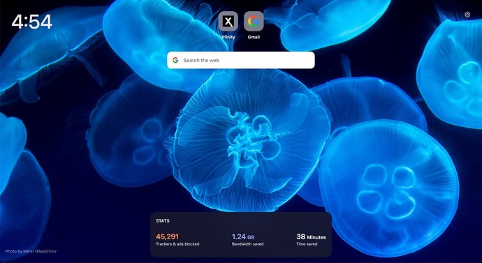
3 Likes

I came for the same reason. I HATE the new home page Favorite scheme . Previously, I thought the offering was too small, but I conceded it was large enough to be useful. Now to separate that into 3 different groups of 6 is inconvenient and removes the point of having it in the first place.

I have also used Brave for many years, and one of the primary reasons was this feature.

There are other browsers that do give me a better choice of this feature.

you can, but it has a period.

IT’S SO BAD

Please please please please bring back the old UI.

I literally signed up just for this. It was so nice and clean, everything a click away and exactly where it needed to be.

Now it’s absolute garbage, I would like to know who were the designers behind it so I can actively avoid hiring those people.

It’s so bad I’m seriously considering not using Brave anymore. I was only using it for that homepage and the adblock. I can install momentum back on chrome and an adblocker.

Thanks for taking this time to write in. As mentioned above, If you prefer the previous design, you can revert to it via this flag: brave://flags/#brave-ntp-refresh-enabled.

Thanks again!

Same, hate this so goddamn much.

“Ah yes, let’s make the centerpiece of our browser’s homepage into a small shitty widget at the very bottom of the screen.“ and the “You know, now that that’s gone, the top sites look kinda stupid. Eh, let’s just move them to the top or whatever.

Nah, not fun enough. Let’s expand the top sites so that the user has to click little annoying white dots on his screen which can only be navigated by their high-dpi mouse that’s gonna click on one of the boxes accidentally anyway.“

This is like that typical “UI/UX-Designer needs to keep his job“-ahh moment at YouTube. Pointless and sad.

Hope they don’t double down on this shitty look and “improve“ it further. Just leave it as it is damnit.

i agree its terrible

Love the New Tab layout design, although I don’t clutter my screen with Favorites so it works for me. I prefer the clean look and use the Bookmarks bar with my over 100 bookmarks I use frequently.

Just taking a brief moment to respond to OP here:

If you just click the overflow button on the widget, you can select “show more items” to display additional tiles here – further, you can now display 2 rows of 12 for up to 24 total tiles which is double what you could display before. We have a support doc here explaining how to use the new layout:
https://support.brave.app/hc/en-us/articles/360057909891-How-do-I-Customize-Top-Sites-on-the-New-Tab-Page
https://support.brave.app/hc/en-us/articles/360040912932-How-do-I-customize-my-New-Tab-Page

Also a slight bit of pushback on the “no one cares about the images” thing – we actually get a surprising number of users requesting information about the images, where they can find them and how they can submit their own. You’re right, this is typically used as a hub and the bulk of your time in the browser will not be spent on the NTP, but that doesn’t mean that there isn’t any value to be found here.

Lastly, as I’ve made a point of many times to similar complaints, user’s also underestimate the complexity in implementing features in the browser (or any software, really). Yes, it would be amazing if we could make it so that every widget is resizable to whatever dimensions you want, can be moved anywhere on the screen, have an infinite number of tiles for top sites/frequently visited sites, change the widget background to be x, y or z color, etc. etc.

These changes, while not impossible, are not done with the flick of the wrist. It requires a ton of work – from the actual design work, to code implementation, usability checks, compatibility considerations (because not everyone is using the same setup), bug testing, etc. etc.

These changes were made now so that we can be in the position to 1 - gather constructive feedback on the new layout, see where we need to improve, what users like and don’t like and 2 - so that when we do go make those changes, they will be ultimately easier to implement down the road, since we’re not refactoring the entire NTP again. Further, in doing that, we’ve also included a change to one of the most requested features we’ve ever had with respect to the NTP is to allow users to display more tiles (top sites) – which you can now do.

FWIW, I do think that transparent backgrounds for the cards/widgets on the bottom is a good idea and is something that I think is very feasible to do down the road. I also think that the other suggestions that you and many other users have mentioned are also good ideas and would be cool but they require time, feedback, testing, etc.

For this and really for any major design changes, you have to start somewhere (and this applies to any software/company) and this is where we started. For anyone landing here on this thread reading this, as OP eventually found out, if you really dislike the new layout that much, simply change the brave://flags/#brave-ntp-refresh-enabled flag to Disabled and you’ll return to the old design and won’t have to worry about it anymore.

Change for the sake of change is NEVER a good thing. Good things can come from that, but it is not inherently a good thing. And to be clear, this is absolutely change for the sake of it. Updating your browser home page setup to give info about whatever random background picture you’ve chosen to share with us is fine. But why re-work the way the favorites/frequently used sites works?

Yeah, now I can expand it to show all 12 of the items I have saved there. Was frustrating finding that out. Turns out if I just “dug a lil deeper” and joined this Community Feedback system, I could have found out… in about the same time it took me to go through various settings options before finding it in the little settings dots off the right of the favorites list. Why is this not an option I can designate from the actually Settings option? Ya know the little obvious gear on the right hand corner of my screen? No good reason. My question is only posed in hopes to make you realize that it SHOULD have that functionality.

Any responses about how “its not that easy to create this stuff” can go right in the trash before you post it. Nonsense. No one is saying its easy mind you. Just that it should be done properly. Not sure about every one else here, but I actually do PAY for this product. I expect better.

By all means, update your software, it’s yours, I’m just the end user over here, actively paying you for it. Of course that also turns back on, pay attention, and give me what I’m paying for. That does not mean, reinvent your wheel as a shameless excuse to justify a salary. I’m already paying for it. Brave is easily my favorite browser to use, and it is literally the ONLY one I’m willing to pay for. Please don’t go around screwing it up, trying to be fancy, or catering to people who prefer to browse on their phones. Phone users should have to make do with whatever works best for PC users, end of story.

Where to input this? I see it mentioned several times but I find nowhere on my browser or Brave interface to input such a control.

[edit] Figured out where to use that, sadly using it does nothing regarding the favorites list, which is exactly what I have a problem with.

did you restart your browser after disabling it? the revert happens on next restart.

@Reik sorry I’m confused – what exactly is the issue with your favorites? If you’re using the old design then it should be exactly the same way it was before the update.

@SkyeN the flag does not reset itself – when a flag is flipped like this, it essentially adds a line of code to the launch path to inform the system to launch it with the changed value every time. In fact, you have to relaunch the browser when you change any flag in order for the change to take place.