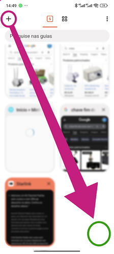
When the navigation bar is positioned at the bottom of the screen, several buttons are moved into the pop-up menu, and the New Tab button becomes harder to access.
Currently, when opening the tab view, the “+” (New Tab) button remains at the top of the screen. This forces the user to reach all the way up — which goes against the purpose of placing the navigation bar at the bottom in the first place. The attached screenshot illustrates this: the “+” button stays at the top while the bottom area (where the hand already is) has no quick way to open a new tab.
This inconsistency impacts ergonomics and overall usability. For that reason, I suggest adding a New Tab button at the bottom of the screen — for example, in the bottom-right corner — whenever the bottom navigation bar is enabled. This would make the experience more coherent, comfortable, and efficient.

