It could improve a lot the use of the new page, there is a lot of room, user could have the choice in settings of number of tiles (number of rows composed of 6 tiles)
I agree. There should be more Top Sites tiles. I always rather use the big and easy-to-click tiles than fumbling through my bookmarks. There should be more customizability in this area. Different size tiles to fill the New Tab screen with variety would be nice as well.
I would prefer an even four rows of eight columns (36) like Mozzilla allows. 10 tiles is just not enough. At least Mozzilla allows you to have choices of number of rows and columns. otherwise, I’m gone.
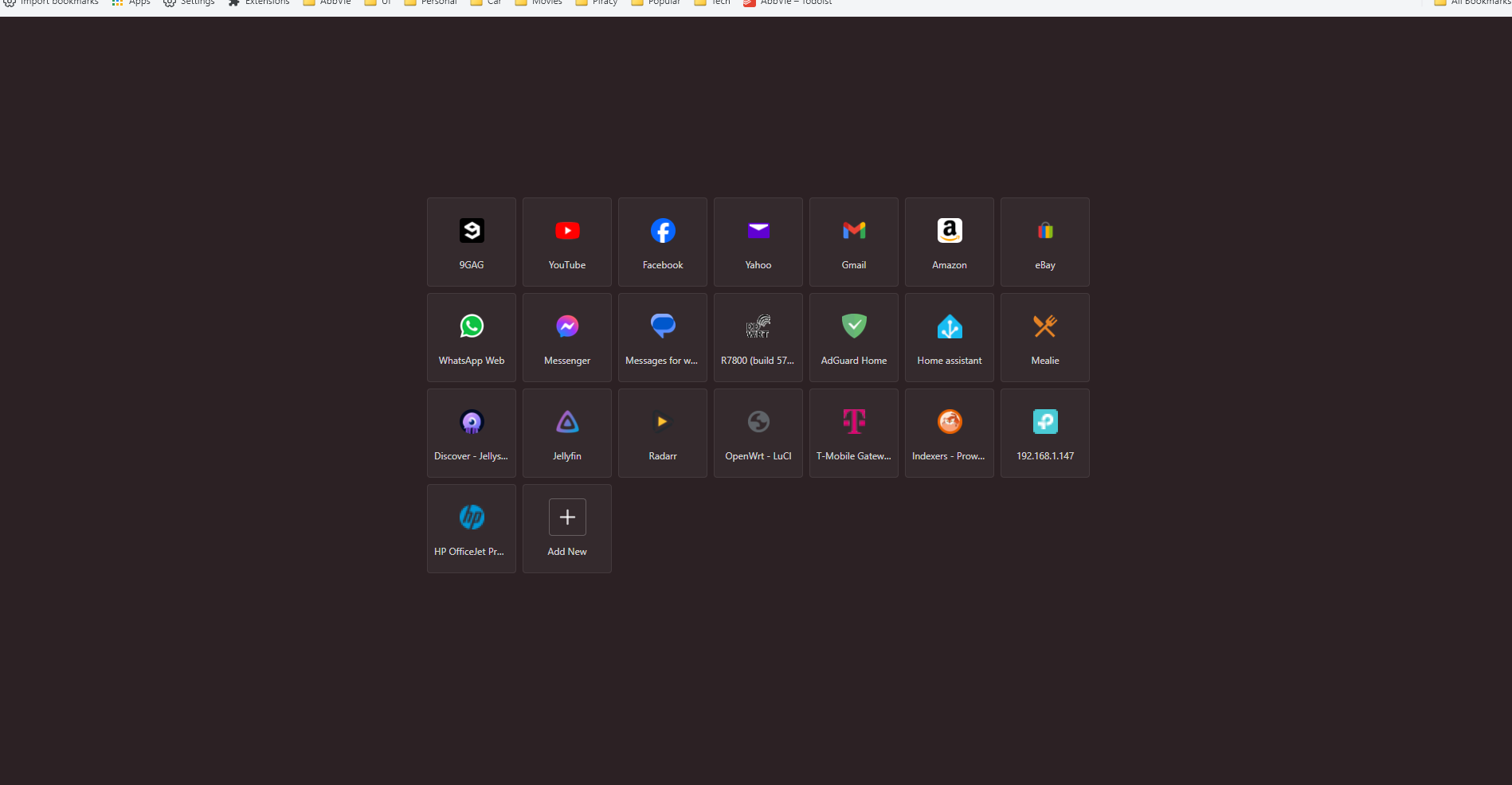
Just to clarify, as far as Frequently visited sites go, these are limited to six, yes. However if you want to have more tiles here, you can set custom sites here as “top-sites” which allows for up to 12 tiles:
I’m not particular about the number or arrangement, but I voted yes for more tiles.
Also it would be nice to allow a tile be a folder (open all on clicking).
The dashboard is a very important page for Brave users; I prefer to see this.
For stats page: small stats line as this will give room for more sites icons and the space for the sponsor is not compromised.
NB. In the begining of each month, the note about the date of the payout makes the features at bottom right almost invisible.
For news: 3 headlines per line is best. It’s quicker to scroll and no need for big images headlines because at the end you have to click on them to see the news details.
Ya I’m going to need MANY more tiles than 12, try unlimited. Not only that, I want to be able to group them. Personally I really LOVE how Opera has done that and until Brave will allow more tiles, I am not ready to switch.
Live in Nightly 1.43.x. Top sites pagination implemented. 12 top sites per “page”. I created two pages (24 sites) and had another page available. Worked fine. Do not know if there is a max and wasn’t going to test more. lol Cannot add duplicate url so that is great (although others may disagree)! Can drag icons between pages to rearrange icons (a little cumbersome to me but worked). Several related Brave GitHub issue reports linked below.
Brave Release version 1.43.x scheduled for Aug 30.
The multiple rows would be a great addition. If nothing else please make the way to change the favorite sites button bigger. It’s annoying trying to click this small button. Very unnecessary IMO.
I’m sure they have a lot of excuses and all, but primary one is just that they want to leave space for NTP ads. If they allow us to have a crapload of top sites there, then it would flood out any of the advertisements behind it. Definitely wouldn’t be a good thing when it comes to ad sales.
Besides, no real rhyme or reason for us to have that anyway. If you need all your bookmarks or top sites, just make that your home page. Or otherwise just use your bookmarks bar and/or sidebar to access it.
Its one of the most ridiculous thing about Brave. If you inspect the page elements, the rows can be changed. Can Brave Devs get this hardcoded? I cant image that being difficult
Unless you need to see shields statistics and other Brave-specific things on the New Tab Page, you can install one of several extensions that are replacements for that page. They typically use the topSites API, which tracks the 12 most popular pages. https://chromewebstore.google.com/search/new%20tab%20speed%20dial
Alternatively, I have an extension which you can add unlimited bookmarks to and have it pop up above any page. You can open multiple links without using the mouse.
Most of extensions are clunky, poor icon support, or just down right ugly. I was hoping to find something that resembles the original without connecting to 3rd party for icons as I run a lot of self hosted services.
There’s an extension called “Nice speed dial 4” works well but comes with a 4x4 or 5x5 grid only. Editing the column code, makes it 7 columns. I think I will stick with this because the code sticks between restarts/updates. If someone can fork the github, add a clock and a background, would be perfect.
I Use Mozilla Firefox and I can put 8 rows of 10 columns (80) on the full Home Page, just playing with the configurations… (there are tips ont the internet about how to do it). I wish Brave could do the exact same thing.
Besides, no real rhyme or reason for us to have that anyway. If you need all your bookmarks or top sites, just make that your home page. Or otherwise just use your bookmarks bar and/or sidebar to access it.
It’s NOT the same.
Never assume that your needs are the same as everyone else’s. For example, I use Firefox with a Home Screen with 80 (8 rows by 10 columns) of the bookmarks that I REALLY use the most (not all my favorites, just the most used). They are NOT the same bookmarks that I have in Firefox’s Bookmark Menu (I use those much less).
In other words, the way I use the Browser, the favorite site icons list that appear on my Home Screen is DIFFERENT from the bookmarks in the Bookmarks Menu, and I don’t want at all the two to be the same (for me, it would be pointless). I can add, edit or even delete a bookmark on Home Screen without change anything in the Bookmark Menu List, because they are not the same.